Our simulations are far too computationally intensive to run on normal computers, so they’re run on the Stampede supercomputer at the Texas Advanced Computing Center. Stampede is a massive cluster of computers. It’s made up of 6400 nodes, and each node has multiple processors and 32GB to 1TB of RAM. The total system has 270TB of RAM and 14PB of storage. It’s hard to put these numbers into terms we can compare to our laptops, but essentially, this is enough computing power to simulate the universe with.

Sometimes people ask if I use the telescope on top of Pupin, and when I answer “No,” they wonder what on earth I’m doing with my time. Mostly I write code and run scripts. This sort of astrophysics sounds unglamorous, but it amazes me. All I need is my computer and an internet connection, and I have the real universe and any theoretical universe I can dream up at my fingertips. Computers and the internet have completely changed the way we do science, and Stampede is just one reminder of the capability and potential of these new scientific tools.
Author: Rasmi
The Importance of Data Visualization in Astronomy
It is difficult to understate the importance of data visualization in astronomy and astrophysics. Behind every great discovery, there is some simple visualization of the complex data that makes the science behind it seem obvious. As good at computers are becoming at making fits and finding patterns, the human eye and mind are still unparalleled when it comes to detecting interesting patterns in data to reach new conclusions. Here are a few of my favorite visualizations that simply illustrate complex concepts.
Large Scale Structure
As we’ve mapped increasing portions of the known universe, we’ve discovered astounding structures on the largest scales. Visualizing this structure in 2D or 3D maps gives us an intuitive grasp of the arrangement of galaxies within the universe and the forces the creation of that structure.
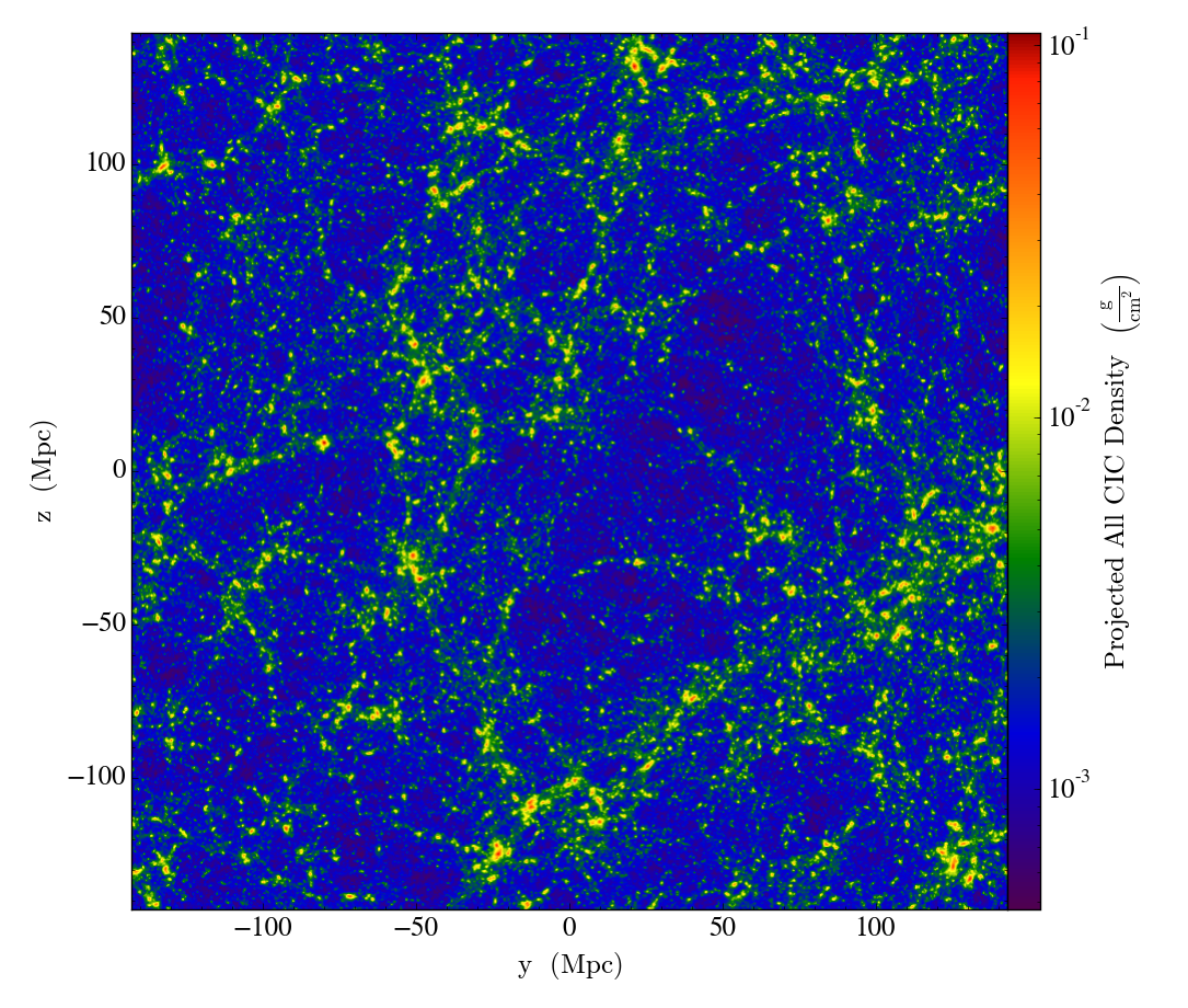
Galaxy filaments
The Sloan Digital Sky Survey is a massive scientific undertaking to map objects of the known universe. Hundreds of millions of objects have been observed going back billions of years. It may seem overwhelming to even begin processing this data, but a simple map of the objects in the sky provides immediate insight into the large scale structure of our universe. We find that galaxies are bound by gravity to form massive filaments, and that these filaments must contain mass beyond what we can see (in the form of dark matter) to form these web-like structures.
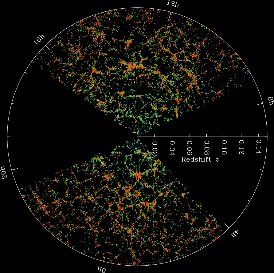
Fingers of God

If you plot galaxies to observe large-scale structure, a peculiar pattern emerges. The structures seem to point inward and outward from our position in the universe. This violates the Cosmological Principle, which states that no position in the universe should be favored over any other. So why do these filaments seem to point at us? The cause of these “Fingers of God” is an observational effect called redshift-space distortion. The galaxies are moving due to larger gravitational forces of their cluster, as well as the expansion of the universe, so their light seems to be accelerated towards or away from us. Correcting for this effect gives us the more random filaments we see above.
Expansion of the Universe
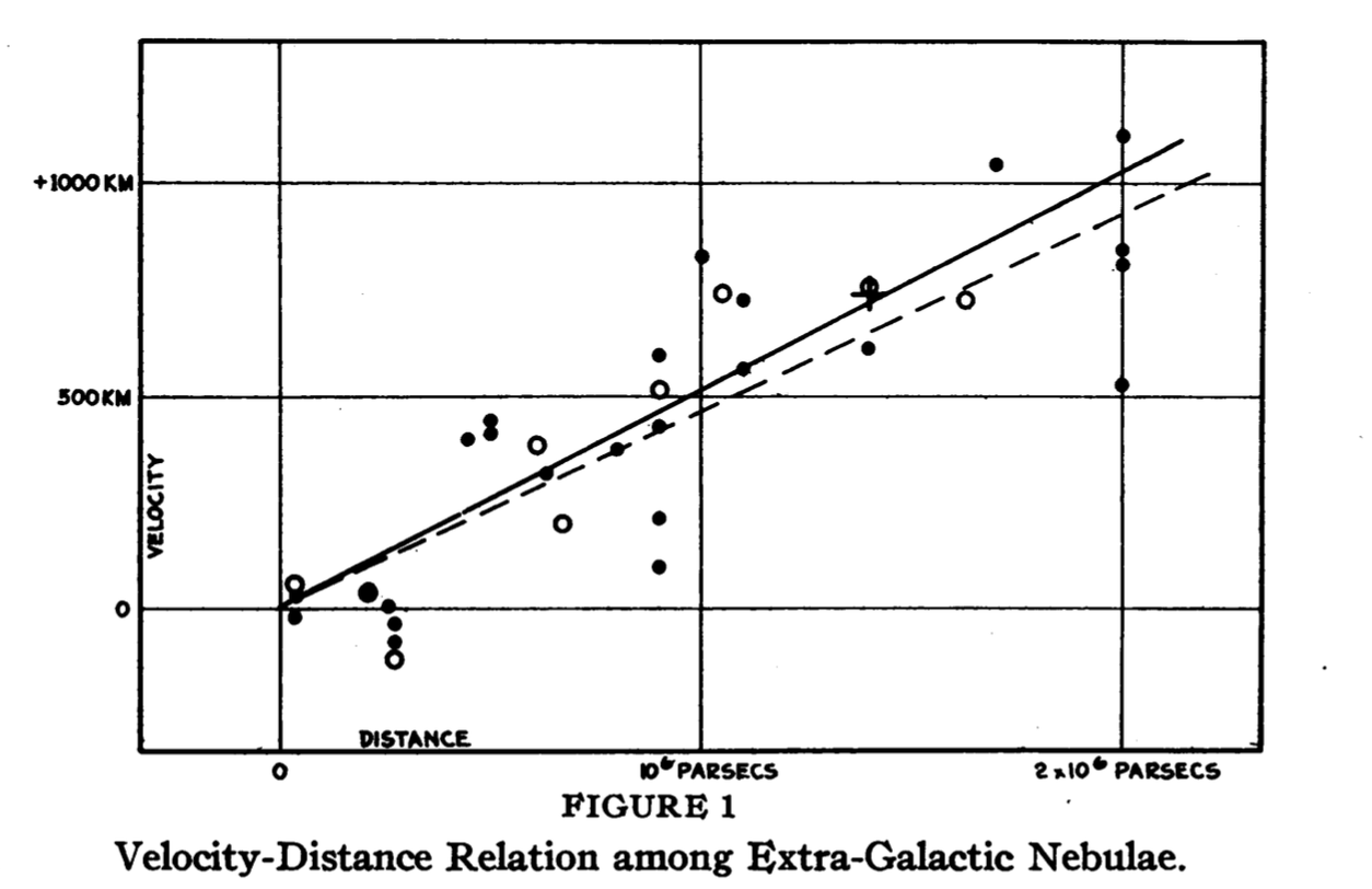
In 1929, Edwin Hubble published a simple yet revolutionary plot. He plotted the distance of galaxies from us, and the velocities at which they moved toward or away from us. What he found was that the farther away a galaxy was, the faster it moved away from us. This could not be the case in what was thought to be a static universe. Hubble’s Law came to prove that our universe was in fact expanding.
Galaxy Rotation Curves
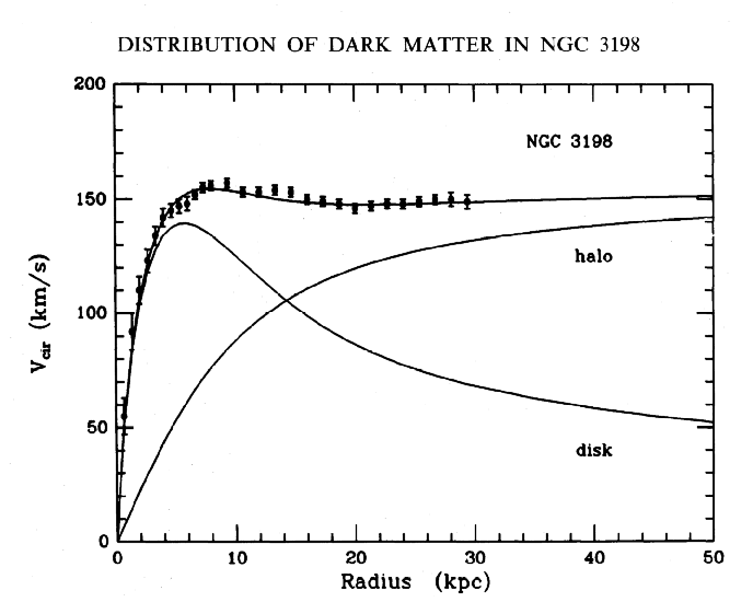
When we plot the rotational velocity of galaxies, we expect the rotational velocity to fall off as the radius increases based on the mass we can observe. As we get further away from the center and into less-dense regions, the matter should lose angular momentum and rotate slower. However, plotting rotational velocity curves reveals something peculiar — the rotational velocity remains constant regardless of radius as you leave the center. This means there must be matter we aren’t seeing: dark matter.
Our own research
Visualization has proved important in our own research as well. Simple sanity checks on the large-scale structure of our simulations helps us make sure our simulations are running properly. Plots of different parameters show simple relationships that arise from the physics of our simulations.
Graphing Google Voice Data

I finally finished off some nice plots of my daily text message history for the past ~40 months. The most difficult part was dealing with Google Voice’s terrible exported HTML format. I will post the Python scripts and more detailed plots and interpretations of the data soon, once things are more polished, so more people can plot out and interpret the mundane details of their lives!
Operating on Assumptions
Over the past few weeks, our Design for America team has made a different type of progress in our ongoing research in the state of community and education in the Harlem community. When we started off, much of the difficulty of moving forward was in organizing all of our thoughts and goals effectively. We had no lack of ideas — we could talk about education for a sustained three hours every Monday night without a problem — but the weeks passed, and we soon found ourselves having actually created little despite having thought of a lot.
We had researched for weeks and discovered all sorts of useful information, but we could go on doing this for months — eventually, we had to converge on some more precise goals and directions forward. Looking back at the pages of research and piles of sticky notes, we converged on a few common themes and narrowed down our target audience and goals. Gaps in reading and literacy as a result of environmental disadvantages consistently came up in our research, parent-student-teacher communication and relationships were regularly found to be critical to early childhood development (parent-student relationships especially affected the child’s later emotional and educational success), and all of this started to set in at an early age, so we decided to focus on elementary school children in the younger end of the K-6 spectrum. Our proximity the Harlem community and Columbia’s messy history with its residents made it our ideal environment to work with. Now we had a more concrete plan to improve the relationships and interaction between parents, students, and teachers centered around reading, hopefully improving literacy rates and fostering a love for reading in the process.
Looking back, the process of refinement began when we started to question and remove our assumptions. The more speculation and hypotheticals we had, the more thinking and research was being done into another semi-related topic — we could go down all sorts of rabbit holes forever had we kept at it. Eventually, the continuing expansion of the theoretical and speculative aspects of our sessions became counterproductive in the ultimate goal of actually implementing something. What allowed us to focus on something specific was simply getting out into the community, visiting libraries, talking to teachers, reaching out to outreach groups, and filling in our unknowns. In some sense, this validated some of our previous research and thought, but it was even more useful in simply letting us know what we shouldn’t focus on. Removing the extraneous left us free to discover and focus on the underlying core ideas of our project.
Of course, this is a constant work in progress, and given the amount of change we’ve seen in the last month alone, it’s to be expected that our implementation and ideas continue to adjust as we learn more and interact with the community at large. I suppose in the design process, we’re learning how to learn, too.
Reinvent 311 Mobile Content Challenge: Homeless Helper NYC
NYC 311, with help from Stack Exchange, held the Reinvent 311 Mobile Content Challenge, which called on developers to use NYC’s revamped Open 311 Inquiry API to make city information more readily available on people’s mobile devices.
I started out focused on education data, but it was messy and too loosely organized to be of any immediate use. If you want to extract meaningful information from it, you could, but it would take some cleaning up and organizing to make useful. It isn’t as easy as displaying an API call from a mobile device.
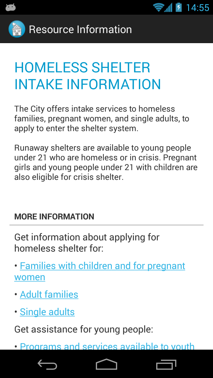
After looking through more of the available data and consider the different use cases, I settled on an app designed to help homeless people in the city. This seemed like a terrible idea at first — how do you use technology to help those without access to it?
A few ideas came to mind. A map of food banks and soup kitchens (along with directions) could be useful. There were also lists of intake shelters online, but no coherent sets of shelters, so a map of shelters would also be useful. Finally, there were also information-based services that the city offered — information on food stamps, homeless prevention, youth counseling, job services, and other outreach information. Putting all of this data together wouldn’t be terribly difficult, and it would create an app that someone might find helpful. Homeless people typically don’t have access to smartphones, but outreach groups like Coalition for the Homeless could use technology to help those without it.

The app is modeled after the data from the API, with different objects for each type of API response. This allowed me to easily create maps give any set of facilities (shelters, food banks, etc.), and information pages given any city service. In this sense, the Open Inquiry API’s design has allowed for flexibility in adapting the app to easily include more data.
One of the main strengths of the Open 311 API is that once an app is created for one city, it should be seamlessly compatible with data from another city, since the API calls are all the same — all that changes is the city that serves up the data. This is a fantastic ideal outcome, but the implementation is slightly off, especially in this particular use case. The data I used needed minor refinements — nothing extreme, but I had to manually decide which services were relevant to this audience, since there is no “homeless” category. I also whipped up some quick Python scripts to add more useful latitude/longitude data from street addresses using the Google Maps Geocoding API.
Perhaps the biggest flaw in the data is the lack of information in API calls. One of the goals outlined by the people at NYC 311 was to reduce the number of calls to 311 asking for information that was readily available online. A mobile app is a great way to make this information more immediately available, but for most services, nothing more than a description was offered. The “More Information” and “FAQs” sections simply said “Call 311 for…” — the data isn’t useful if it simply redirects to the old method of calling for information.
Besides the lack of completeness and consistency in the city’s data, the potential for interesting tools and visualizations is clear. There’s a ton of data, the challenge is in sifting through it and making it easily usable.
The demo event itself was fantastic fun. The other contestants had impressive applications, most of which focused on low-income resources and real estate data. I met Joel Spolsky, who offered some sharp and honest advice for the contestants (think StackOverflow, but in person), Noel Hidalgo, who runs BetaNYC as a part of Code for America (check out their projects here), the talented people of StackExchange, designers from HUGE, and a gaggle of kind people from NYC 311. In the end, Homeless Helper NYC won a prize for “Best presentation of 311 information targeting a specific audience,” and it’s out now on the Play Store. You can also contribute to the source code on GitHub!
Sage for Android Testing APK Now Available!
After much revision and cleaning-up, the Sage Android application is now at a point where most basic features are functional, and bug reporting, feature requests, and general feedback are needed as work on the application progresses. If you’d like to try the latest APK, you can download it here. Features are always being added (an updated APK with History and Favorites will be available soon!), and you can track the latest updates at the GitHub repository.
As always, feedback and suggestions are much appreciated. Thank you!
First Handshake: Meeting the Sage Cell Server
The first and most immediately important task of updating the Sage Android application as part of Google’s Summer of Code is to update the way the app interacts with the Sage Cell Server, which performs the calculations in the cloud so that the Android device doesn’t have to locally. Currently, the application communicates with the server through a series of HTTP requests — the client (our app) initializes the connection, then sends and receives query data back and forth from the server. This all sounds fine and efficient, but by relying solely on HTTP requests, the client ends up having to constantly poll the server to check the status of the calculation (to see if there are any updates), which is inefficient and not ideal for a light application on a light device. It’s a decent way of doing things, but the year is 2013, and the Sage Cell Server now supports WebSocket, so my first task is to update the app’s client-server interactions so that users can once again send calculations and receive results.
First, the client must make initial contact with the server in a sort of “handshake” between the two. The app will send an HTTP request, and the server will reply with connection details, at which point the WebSocket connection may be established. This seems easy to implement, but as someone who hasn’t spent much time with networking in Java, I had some difficulty getting hands to shake. The requests I was sending were seemingly correct, but the response I received was similar to that of visiting the site directly from a web browser — 405: Method Not Allowed. How could I let the server know that the app was special, and that it wanted to have meaningful interactions together? With some help from Volker, I was able to see that the issue was in the headers of my request. First, it seemed as if I should use GET instead of POST, which turned out not to be the case.
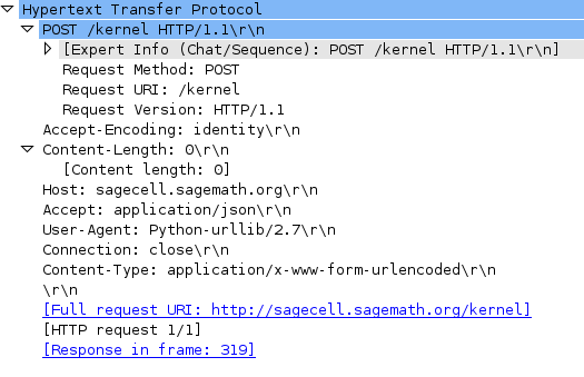
I was advised to make use of WireShark to inspect each request I was making (using the Python sample client as my example of proper HTTP ettiquette). A POST request was being made, but it was being made to the wrong URI — I ended up using Java’s built-in URI functionality to generate one properly. At this point, all that was holding my request back from serverside acceptance was its headers. By adding Accept-Econding:identity, I finally had intialized a proper POST request, as indicated by the server’s response.

At this point, the server responds with a simple JSON object that contains a “kernel_id” and the “ws_url”, indicating that it is ready to begin our session with the information provided. Using the WebSocket URL and the kernel ID, it is simple at this point to establish a connection through one of the many fine WebSocket libraries that exist for Android. Two connections are made: an IOPub socket and a Shell socket. Once the connection is established, the rest is simply a matter of sending and receiving calculations and results in JSON form on both channels. The IOPub channel details the status of the calculation, while the Shell channel deals with the calculation and results themselves. Data is only sent and received when something has actually happened (at which point either the client or server can react accordingly), and once everything is done, the connection is closed. Especially when considering more advanced features such as Interacts, the improvement in networking and overall efficiency and simplicity from switching over to these sockets is clear.
Handling results and sending/receiving calculation data in general should be simpler now that the client/sever networking process is simplified. Now, it is a matter of getting everything to work together in order for us to run calculations from the app itself.
Although at this moment it has no functional networking capabilities (and therefore cannot perform calculations), you can download the older version of the Sage Math Android app from the Play Store and view (and even contribute to!) the source on GitHub. You can also read more about the Sage Cell Server and its interactions on the GitHub Wiki.