Navigating Mapbox and Mapzen

As I build out CityGraph, I’ve run into the question of which mapping libraries and services to use and why. My purposes are focused on overlaying various types and representations of datasets on (mostly) city-level maps, and modifying those visuals according to user interaction. Here’s what I’ve learned:

Why not Google Maps?

From the start, I narrowed my decision down to Mapbox and Mapzen because they have more robust data visualization APIs and are based on OpenStreetMap. To their credit, I believe Google Maps has better and more reliable data than OpenStreetMap, but I feel it is important to run an open data based service on open mapping data and open source libraries. Additionaly, for my purposes, which are heavily focused on data visualization and interactivity, Google Maps’s lackluster datavis APIs would leave me to rely on something like Leaflet, which doesn’t take advantage of the excellent WebGL features that Mapbox and Mapzen’s libraries have.

Mapbox and Mapzen

Between Mapbox and Mapzen’s rendering libraries and data services/APIs, the choice comes down to what your use cases are. Mapbox has the superior rendering libraries — Mapbox GL libraries work across the web, iOS, and Android. Mapzen has a WebGL renderer, but their mobile library is still in its early stages of development Mapbox seems like the smart choice here.

With respect to data access and API usage, the situation becomes more complicated. If you’re building a commercial application with Mapbox, you have to start out with Mapbox’s Premium plan, which runs at $499/month. If you’re a business with any revenue at all, this is almost certainly worth it, and you can negotiate a higher-tier plan if you exceed the Premium plan’s rates. However, if you aren’t ready to start with the Mapbox Premium plan, Mapzen may be the better choice, because they allow commercial apps to use their free tier. If you don’t care about commercial mapping licensing or supporting thousands of users, then either service’s free tier APIs will almost certainly suit your needs. Mapzen’s rate limits for their free tier are incredibly generous, more so than Mapbox’s, and you can grow your application to support many users before even having to worry about upgrading. It seems their pricing plans are still under development, but I can’t imagine their prices settling any higher than those of Mapbox.

An Ideal Compromise

Ultimately, I decided to go with Mapbox’s libraries for their better cross-platform support and feature-completeness; however, for mapping data and APIs, I chose Mapzen’s services. Every aspect of Mapzen’s stack, from routing to geocoding to tile generation and serving, is open source. So in theory, if you wanted to host your own rate-unlimited Mapzen instance, you could (though it would likely be far more expensive than simply paying Mapbox or Mapzen for their services). And if either service were ever shut down, you could still run your own instances of Mapzen’s open source software and get the same usability. Luckily, Mapbox’s libraries make it easy to use Mapzen’s services. If you have the revenue to do so and aren’t paranoid of a shutdown, paying for Mapbox’s APIs may be the simpler decision. However, Mapzen’s open source approach is inviting and reassuring, and its compatibility with Mapbox’s web and mobile rendering libraries gives me the best of both worlds.
dotAstronomy Day 1

James Webb Space Telescope and Astronomy

Sarah Kendrew (ESA, STScI)

JWST goes well into the infrared
Launch Autumn/winter 2018 — lots of things that can go wrong, but these engineers are awesome.
Science proposals start November 2017.
Routine science observations start six months after launch.
Compared to next-gen observatories, JWST is an old school telescope. We can bring it into the 21st century with better tools for research.
Coordination of development tools with Astropy developers.
Watch the clean room live on the WebbCam(ha!).

Bruno Merin (ESA)

ESASky – a Multi-Mission Interface

Open Source Hardware in Astronomy

Carl Ferkinhoff (Winona State University)

hardware.astronomy
Bringing the open hardware movement to astronomy
1) Develop low(er) cost astronomical instruments
2) Invest undergrads in the development (helps keep costs low).
3) Make hardware available to broader community
4) develop an open standard for hardware in astronomy

Citizen Science with the Zooniverse: turning data into discovery (Oxford)

Ali Swanson

Crowdsourcing has been proven effective at dealing with large, messy data in many cases across different fields.
Amateur consensus agrees with experts 97% of the time (experts agree with each other 98% of the time), and remaining 3% are deemed “impossible” even by experts.
Create your own zooniverse!

Gaffa tape and string: Professional hardware hacking (in astronomy)

James Gilbert (Oxford)

Spectra with fiber optic cables on a focal plane.
Move the cables to new locations.
Use a ring-magnet and piezoelectric movement to move “Starbugs” around — messy, inefficient.
Prototyped a vacuum solution that worked fine! This is now the final design.
Hacking/lean prototypes/live demos are effective in showing and proving results to people. Kinks can be ironed out later, but faith is won in showing something can work.

Open Science with K2

Geert Barentsen (NASA Ames)

Science is woefully underfunded.
Qatar World Cup ($220 billion) vs. Kepler mission ($0.6 billion)
Open science disseminates research and data to all levels of society.
We need more than a bunch of papers on the ArXiv.
Zooniverse promotes active participation.
K2 mission shows the impact of extreme openness.
Kepler contributed immensely to science, but it was closed.
Large missions are too valuable to give exclusively to the PI team — don’t build a wall.
Proprietary data slows down science, misses opportunities for limited-lifetime missions, blocks early-career researchers, and reduces diversity by favoring rich universities.
People are afraid of getting scooped, but we can have more than one paper.
Putting work on GitHub is publishing, and getting “scooped” is actually plagiarism.
K2 is basically a huge hack — using solar photon pressure to balance an axis after K1 broke.
Open approach: no proprietary data, funding other groups to do the same science, requires large programs to keep data open.
K2 vs K1: The broken spacecraft with a 5x smaller budget has more authors and most publications, and more are early-career researchers because all the data is open. 2x increase, and a more fair representation of the astro community.
Call to action: question restrictive policies and proprietary periods. Question the idea of one paper for the same dataset or discovery. Don’t fear each other as competition — fear losing public support.
The next mission will have open data from Day 0 thanks to K2.

Lightning Talks

#foundthem

Aleks Scholz (University of St Andrews)

SETI, closed science vs open science and communicating with the public.

astrobites

Ashley Villar (Harvard)

Send your undergrads to Astrobites! Advice, articles, tutorials.

There is no such thing as a stupid question comic book

Edward Gomez (Las Cumbres Observatory)

Neat astro comic book for kiddos.

Astronomy projects for the blind and visually impaired

Coleman Krawczyk (University of Portsmouth)

3D printing galaxies as a tool for the blind.

NOAO Data Lab

Matthew Graham (Caltech/NOAO)

Classifying Stellar Bubbles

Justyn Campbell-White (University of Kent)

Citizen science data being used in a PhD project.

The Pynterferometer

Adam Avison (ALMA)

A short history of JavaScript

William Roby (Caltech)

JavaScript is more usable thanks to ES6, and it follows functional principles. Give it another try if you’ve written it off!

Asteroid Day – June 30th, 2016

Edward Gomez (Las Cumbres Observatory)

International effort to observe NEAs with Las Cumbres.

The Importance of Data Visualization in Astronomy

It is difficult to understate the importance of data visualization in astronomy and astrophysics. Behind every great discovery, there is some simple visualization of the complex data that makes the science behind it seem obvious. As good at computers are becoming at making fits and finding patterns, the human eye and mind are still unparalleled when it comes to detecting interesting patterns in data to reach new conclusions. Here are a few of my favorite visualizations that simply illustrate complex concepts.

Large Scale Structure

As we’ve mapped increasing portions of the known universe, we’ve discovered astounding structures on the largest scales. Visualizing this structure in 2D or 3D maps gives us an intuitive grasp of the arrangement of galaxies within the universe and the forces the creation of that structure.

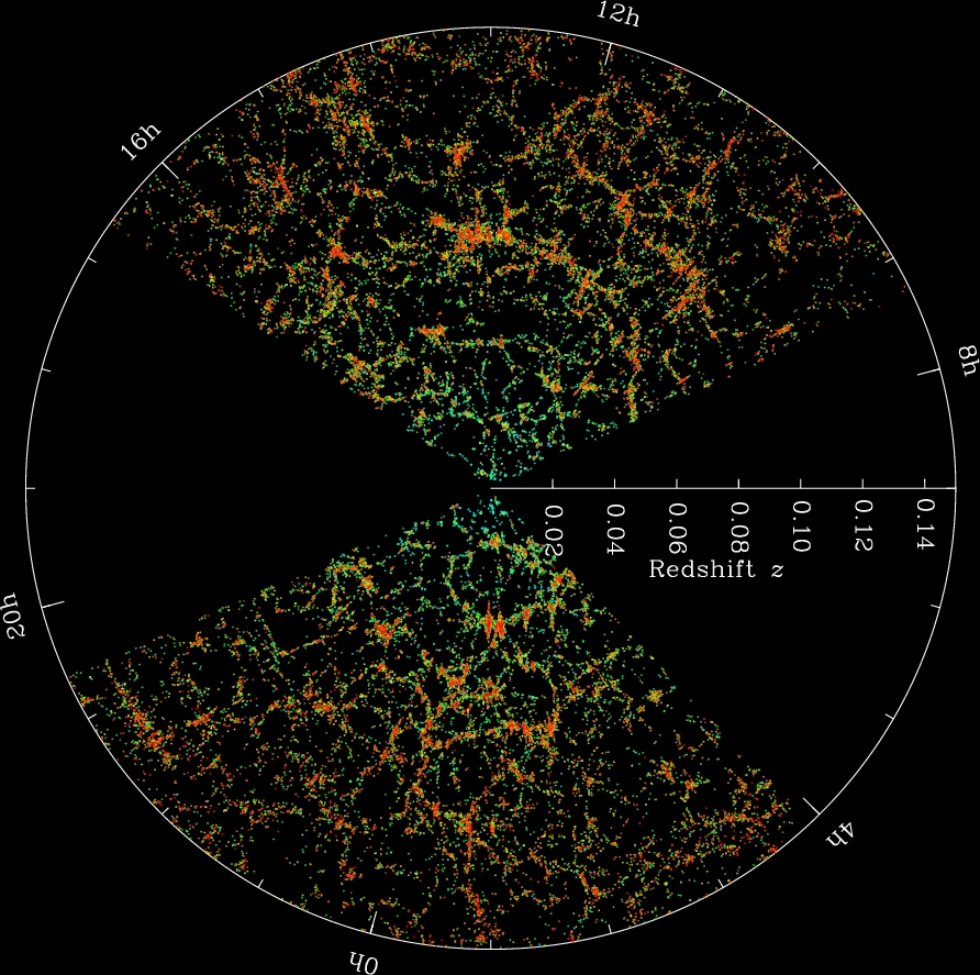
Galaxy filaments

Sloan Digital Sky Survey
The Sloan Digital Sky Survey is a massive scientific undertaking to map objects of the known universe. Hundreds of millions of objects have been observed going back billions of years. It may seem overwhelming to even begin processing this data, but a simple map of the objects in the sky provides immediate insight into the large scale structure of our universe. We find that galaxies are bound by gravity to form massive filaments, and that these filaments must contain mass beyond what we can see (in the form of dark matter) to form these web-like structures.

Fingers of God

Fingers of God
If you plot galaxies to observe large-scale structure, a peculiar pattern emerges. The structures seem to point inward and outward from our position in the universe. This violates the Cosmological Principle, which states that no position in the universe should be favored over any other. So why do these filaments seem to point at us? The cause of these “Fingers of God” is an observational effect called redshift-space distortion. The galaxies are moving due to larger gravitational forces of their cluster, as well as the expansion of the universe, so their light seems to be accelerated towards or away from us. Correcting for this effect gives us the more random filaments we see above.

Expansion of the Universe

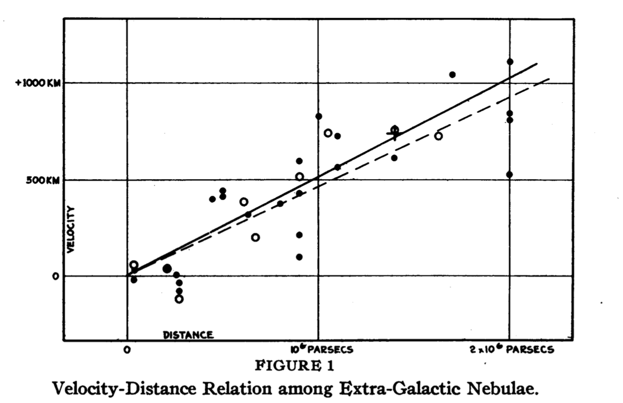
Hubble's Law
In 1929, Edwin Hubble published a simple yet revolutionary plot. He plotted the distance of galaxies from us, and the velocities at which they moved toward or away from us. What he found was that the farther away a galaxy was, the faster it moved away from us. This could not be the case in what was thought to be a static universe. Hubble’s Law came to prove that our universe was in fact expanding.

Galaxy Rotation Curves

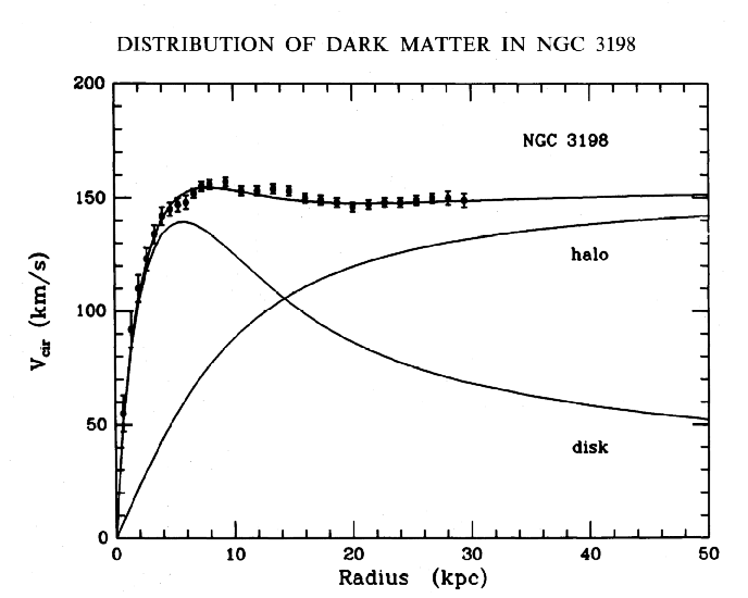
Rotation Curve of NGC3198
When we plot the rotational velocity of galaxies, we expect the rotational velocity to fall off as the radius increases based on the mass we can observe. As we get further away from the center and into less-dense regions, the matter should lose angular momentum and rotate slower. However, plotting rotational velocity curves reveals something peculiar — the rotational velocity remains constant regardless of radius as you leave the center. This means there must be matter we aren’t seeing: dark matter.

Our own research

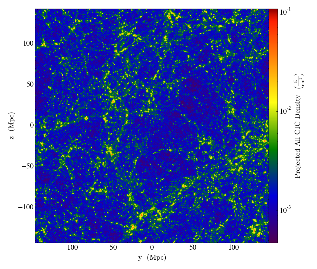
Density Plot
Visualization has proved important in our own research as well. Simple sanity checks on the large-scale structure of our simulations helps us make sure our simulations are running properly. Plots of different parameters show simple relationships that arise from the physics of our simulations.

Graphing Google Voice Data

I finally finished off some nice plots of my daily text message history for the past ~40 months. The most difficult part was dealing with Google Voice’s terrible exported HTML format. I will post the Python scripts and more detailed plots and interpretations of the data soon, once things are more polished, so more people can plot out and interpret the mundane details of their lives!